ShopDreamUp AI ArtDreamUp
Deviation Actions


Suggested Deviants


Suggested Collections


You Might Like…


Featured in Groups

Comments3
Join the community to add your comment. Already a deviant? Log In
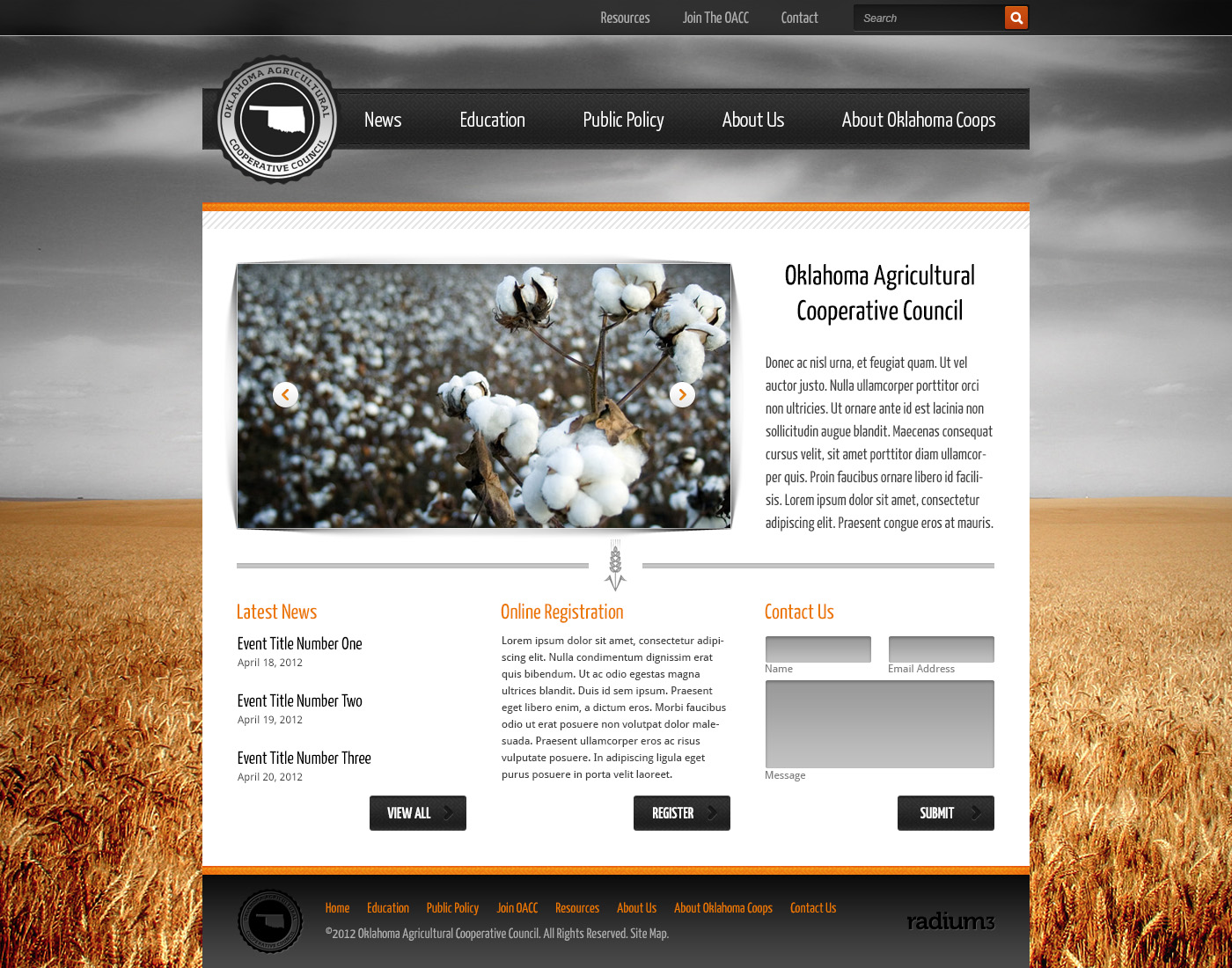
Looks alright. It bothers me that it is so plain and it does not catch my attention. it just sits there and evokes nothing, but how much emotion could a agricultural cooperative website even evoke. Everything seems to complete itself in a mature and thoughtful manner. which is always nice to see in a design.
i hate the fact that this looks too much like every other design out there. there are very little things that makes this stand out. it is true though that i have no knowledge about other agricultural websites out there. still seems to me that i have seen this before.
otherwise the color palette is nice and the design although very simple serves its purpose. i like the background. it works well with the whole theme of the design.
PS: the lower gradient should be more subtle, i think it changes to quickly and too much.